




A layout nobody can turn into a live page solves nothing. That is the difference between a design file and a marketing asset: the first sits in a browser tab, the second collects visits, form fills and enrollments.
Marketing teams at educational institutions hit this bottleneck every week. The campaign is approved, the budget is released, and the page stalls at the drawing stage.
Learning how to use Figma removes most of that dependency, so a color change or a new headline no longer requires an outside request. The tool runs in the browser, keeps a full version history, and shows developers exactly what they need to measure.
The work runs from a blank file to exported assets, including what changed in the product over the last three years. Much of what was taught in 2022 no longer exists under the same name.
What is Figma and why did it become the design standard?
Figma is an interface editor that runs in the browser and lets several people draw in the same file at the same time. Dylan Field and Evan Wallace started the company in 2012, and collaborative editing reached the public in September 2016, according to the company's own public filing.
Collaboration matters to marketing for a practical reason: the copywriter comments directly on the button, the manager approves the headline without opening any software, and the developer pulls measurements from the same file. An approval round stops being a chain of attachments.
The product portfolio grew considerably after 2022. Alongside the design editor there is now FigJam for collaborative whiteboarding and Figma Slides for presentations. Two newer products followed: Figma Make, which turns written descriptions into working prototypes, and Figma Sites, for publishing pages, both announced across 2024 and 2025.
One point still causes confusion in older articles. Adobe announced its acquisition of Figma in September 2022, and both companies mutually terminated the agreement in December 2023. Figma stayed independent and went public on the New York Stock Exchange in July 2025.
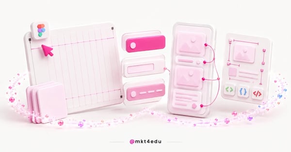 Caption: From an empty frame to a measurement panel: the path that carries a Figma layout into the hands of whoever ships the page.
How do you start a Figma file and pick the right size?
Every page layout starts with a frame, the container where content lives. Before drawing anything, set a reference screen width and create a separate page inside the file for each stage of the work: draft, approved version and handoff.
A width of 1440 pixels works well as a desktop reference because it covers most monitors without forcing horizontal scrolling. For mobile, 390 pixels is a common starting point.
Start with mobile when the campaign runs on social media. Most ad traffic arrives by phone, and a layout designed for a large screen first tends to break when it shrinks.
Watch the free plan limit here. Starter allows a maximum of three pages per file, which gets tight on projects with many variations. Paid plans unlock unlimited pages.
How do layout guides keep page elements aligned?
Layout guides are the invisible lines that hold elements in place inside a frame. Figma defines them as visual aids added to frames so objects stay precisely aligned, and they come in three shapes: columns, rows and a uniform grid.
The name changed, and that trips up anyone who learned the older term. What the documentation used to call a "layout grid" became a "layout guide" in May 2025, and it is a different feature from the grid option inside auto layout.
A twelve-column grid is the most common setup for web pages. It divides cleanly into halves, thirds and quarters, which covers almost any block arrangement without manual math.
Set the side margin and the gutter as well. An 80-pixel margin on desktop and 24 pixels on mobile give text enough room without leaving the page looking empty.
What does auto layout do when the content changes?
Auto layout makes a block rearrange itself when its content changes. In Figma's definition, elements inside an auto layout frame are arranged automatically based on direction, spacing, padding and alignment. Instead of repositioning everything by hand, you declare the rule once.
The clearest case is a card. When a program name runs three lines instead of one, the card grows and pushes the button down, keeping the internal spacing you defined.
That matters a great deal on an institutional page, where program names vary wildly in length. "Law" and "Computer Information Systems" occupy different amounts of space, and the layout has to survive both.
A second behavior often goes unnoticed: the grid flow inside auto layout, which places objects in columns and rows. It handles dashboard and program-catalog arrangements that previously required positioning each item by hand.
How do components and variants stop repeated work?
A component is an element you draw once and reuse across the project. Figma's documentation describes components as reusable elements that keep designs consistent across projects: the main component defines the properties, and every linked instance follows its changes.
Buttons, form fields, headers and footers should be components from the first page onward. Without that, a single brand color change turns into an afternoon of hunting for a forgotten button.
Variants group states of the same element into one container. A button with default, hover, pressed and disabled variants stops being four loose objects and becomes one object with four settings.
Publishing a library to the whole team requires a paid plan, so on Starter, components stay inside the file where they were created. That limit is usually what pushes a team to upgrade.
How do you use Figma to build a landing page that converts?
A capture landing page needs five blocks, in the order a person decides: promise, proof, offer detail, form and objection handling. Figma is where you test that order before anyone codes it, while changing your mind still costs nothing more than dragging a block.
Start with the form and design everything else around it. It is the only element on the page that exists to be filled in, and every extra field lowers the odds of completion.
The promise sits above the fold, with the program name, the format and the application deadline. Someone arriving from an ad needs two seconds to confirm they landed in the right place.
Proof comes before detail, not after. Accreditation, rankings, graduate outcomes or a testimonial with a name and a class year all support the promise you just made.
The structural and hierarchy decisions that apply to any capture page are covered in the landing page best practices, and the navigation logic for institutions appears in the web design and UX best practices.
How do you test the layout with a prototype before coding?
Prototyping in Figma turns a static drawing into a navigable flow. The tool lets you create interactive flows that explore how a user may interact with your designs, and the feature works on any plan, including the free one.
Connect the elements a person will tap to their matching destinations. The form button leads to a confirmation screen, a menu item scrolls to its section, a program card opens the detail view.
Test with three people from outside the project and give each a concrete task, such as applying to the education program. Explain nothing beforehand: the silence is the data.
Note where the person hesitates, not where they complain. Two seconds of hesitation over a button signals an ambiguous label, and that never surfaces in an internal approval meeting.
What does Dev Mode give the person writing the code?
Dev Mode is the Figma space built for whoever turns the design into code. Figma describes it as everything a team needs to navigate design files and transform designs into code, with measurements, colors, spacing and snippets ready to copy.
The feature left the free beta at the end of January 2024 and today ships with the paid plans, on Full and Dev seats. It does not appear on Starter, which usually surprises the person who built the file alone and then handed it to a developer.
Handoff improves dramatically with an organized file. Named layers, published components and a single handoff page cut the back and forth over which spacing counts.
Pair Dev Mode with a ten-minute conversation. The file answers "how much," but only the conversation answers "why," and the "why" is what keeps a layout decision from being undone during implementation.
The four plans differ in what a team can actually do, and the price gap follows the feature gap:
| Plan | Price per full seat | Design files | Dev Mode |
|---|---|---|---|
| Starter | $0 | 3 files, 3 pages each | No |
| Professional | $16 per month | Unlimited | Yes |
| Organization | $55 per month | Unlimited | Yes |
| Enterprise | $90 per month | Unlimited | Yes |
Table: Prices in US dollars per full seat per month, according to Figma's plans page, consulted in August 2026.
For a marketing team of two or three people, Professional is enough. The jump to Organization makes sense when a component library has to be shared across separate departments.
How do you export assets and organize the team in Figma?
Figma exports static designs as PNG, JPG, SVG and PDF. There is no direct WebP output, so converting to that format happens outside the tool, in an image utility or in the CMS itself.
Use SVG for icons and logos because the file scales without losing sharpness and usually weighs less. PNG covers images that need transparency, and JPG covers photography.
Team organization matters as much as file format. Name layers in plain language, keep a single handoff page, and write down inside the file which version is live.
Plugins are third-party scripts that add functionality, installed through the Community. They work on the Starter plan, though not inside Dev Mode.
Where does design fit into digital marketing strategies?
Layout is not an isolated step; it is where the campaign meets the person. A well-designed page whose form never reaches the database produces leads nobody answers, and a well-integrated operation with a confusing page loses the visit before the first field.
Budget pressure makes that alignment sharper. Gartner's 2026 CMO Spend Survey puts marketing budgets at 7.8% of company revenue, with 15.3% of that allocated to AI, based on 401 CMOs surveyed between January and March 2026.
So layout belongs alongside the rest of the plan, not after it. Channel, offer and message decisions live in the digital marketing strategies, and the sector-specific version appears in the educational marketing strategies.
A form designed in Figma has to be born with a destination. Each field maps to a property in the database, and that mapping is what marketing automation and the CRM use to decide who gets answered first.
Close the loop with measurement. The indicators that say whether the page did its job, rather than whether it looked good, are covered in the educational marketing metrics.
Frequently asked questions about how to use Figma
Is learning how to use Figma worth it right now?
Learning Figma is worth it, and the reason is economic before it is technical. A marketing person who builds and adjusts their own layout shortens the campaign cycle by days, and days count when an application deadline will not move.
The basics deliver almost all of the result. Frames, layout guides, auto layout, components and prototyping cover most of what a capture page requires, and none of those five takes more than an afternoon to grasp.
What the tool cannot fix is the operation around the page. An excellent layout with a form disconnected from the database still generates contacts no one follows up on, and that is not a design problem.
Your layout looks great. Does it enroll?
We connect your page design to the funnel that records every application. Talk to the mkt4edu team and find out where your page is losing candidates.
A prototype settles how the page looks. What decides whether it enrolls is the funnel behind it, measured page by page through conversion analysis.


.jpg)























 Portugal